
Shake Shack App Redesign
Visual Design — Interaction Design — Art Direction

The Problem
We built Shake Shack's current app in 2015. And though 3 years isn't a lot of time, as Shake Shack started to grow and eye new initiatives like a loyalty program and delivery, we realized the app is limiting in more ways than what initially meets the eye:
- Starting from the moment you choose a timeslot, there is a 10 minute timer to compile your order, enter your credit card information, and pay.
- The current app was not built with loyalty, delivery, or cross-and upsell in mind
- The app was a little bloated with uneccesary features that weren't being used by users.
The Goal
High Level Goal
Our high level goal was to design a holistic order-ahead experience that keeps the core of what we've built, while delivering on opportunities, addressing pain points, and setting the stage for the future.
Our Approach
- Addressing current pain points: Optimize the current path to purchase flow and menu architecture.
- Increasing average order size: With app orders being on average 15% more than in-store, Shake Shack wanted to leverage more opportunities for up-sell, cross sell, and cross-promotion.
- Designing for the future of Shake Shack: This app is to be a digital extension of Shake Shack and another touchpoint for fans of Shake Shack, and we wanted to give users a reason to connect "beyond the burger".
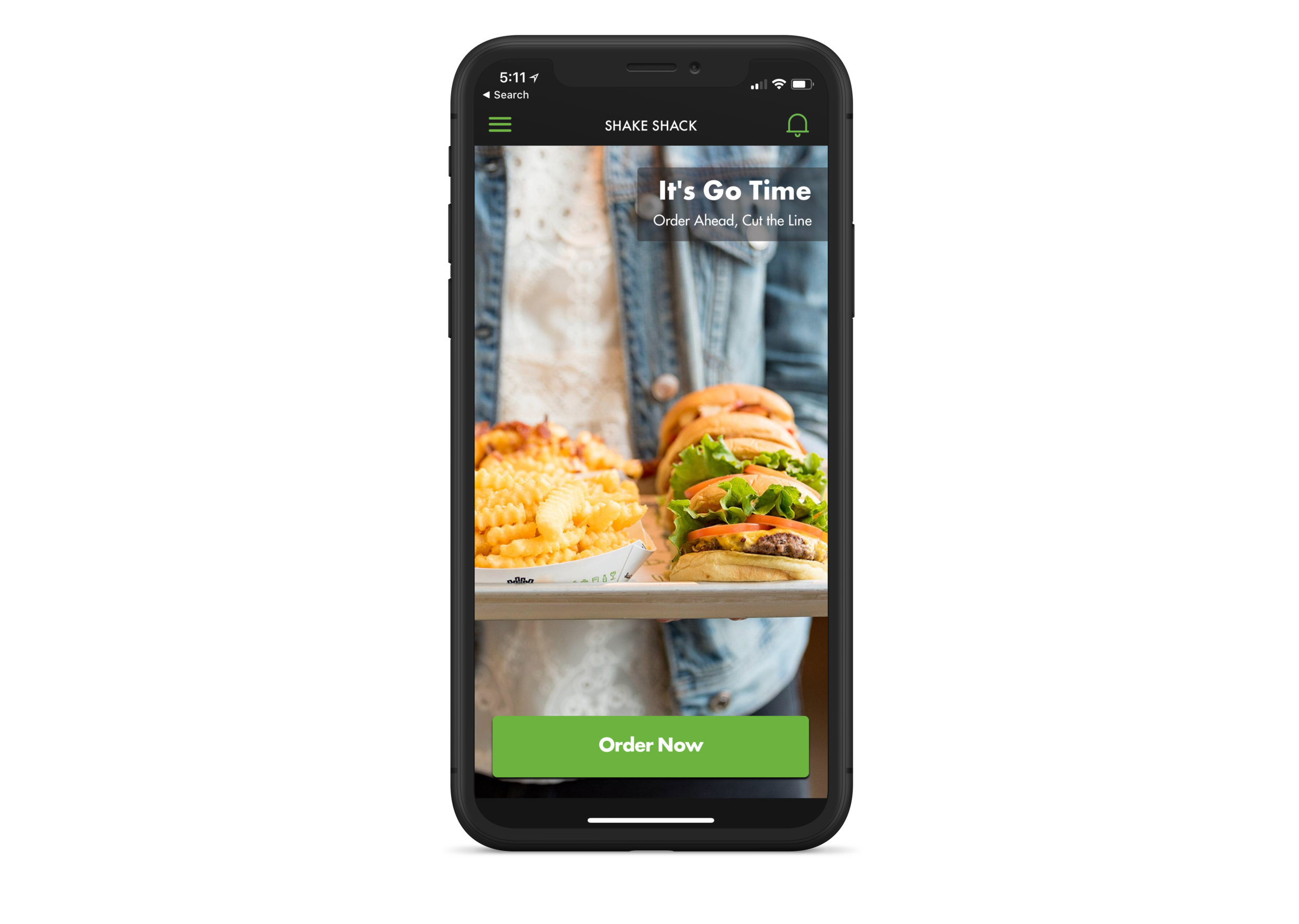
The current app is dark and dated
Addressing Pain Points
Optimizing the path to purchase flow
In the current flow, a user selects a time alot before compiling their order. In order to keep the time-slot the user selected, a 10-minute timer is implemented throughout the flow. This created a sense of urgency and was not inclusive of differently-abled users or even just users who weren't near their credit card.
Our solve was to move the selection of the time-slot after the user has compiled their order, greatly eliminating the tension it caused.

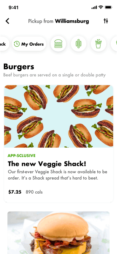
Improving the menu architecture
Currently, the menu is seperated by category, requiring the user to act when they want to view a different category of foods. Additionally, a user must make 2 sets of decisions when selecting and modifying a menu item these interaction patterns increase the amount of steps a user has to take to compile an order.
Our solve to decease the number of taps and steps was to combine multiple steps of user decisions into one, by making the menu infinitely scrollable, and changing the architecture of the menu item detail page.
Increasing average order size
Leveraging opportunities for upsell and cross-sell
With orders in the app averaging 15% more than orders in-store, Shake Shack wanted to explore more areas to elegantly explore upsell and cross-sell.

Designing for the future of Shake Shack
I believe the current app, would have been a great app after we'd implemented our optimizations to the path-to-purchase flow. But that would have just been making a decent app, better. We wanted to make it the best it could be.
Looking on the bright side
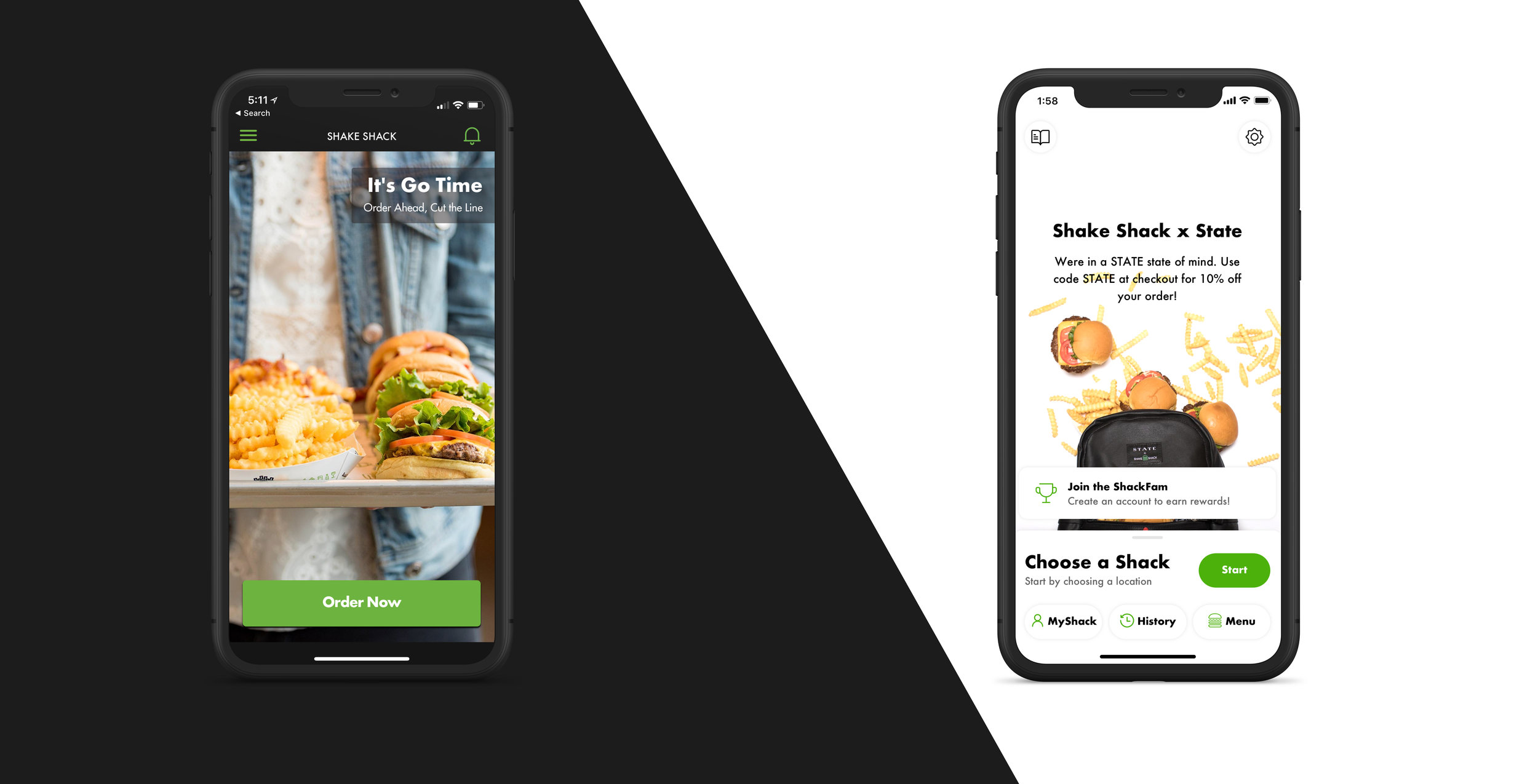
So here's the scary part: The visual design of this app is literally night and day.
Shake Shack's current branding is pretty dark, and even the interiors of its restaurants have dark wood floors and employee's wearing black shirts.
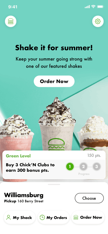
In our first design, we embraced this fully, and made an app that, 3 years later, looks and feels dated, utilitarian, and unwelcoming. Meanwhile, Shake Shack was embracing wild, bright colors and beautiful, loud, and vibrant marketing imagery. They were starting to look towards the future, to open up, and connect more with their customers. They wanted to lighten up. We couldn't have agreed more.
So here's the scary part: The visual design of this app is literally night and day.
Shake Shack's current branding is pretty dark, and even the interiors of its restaurants have dark wood floors and employee's wearing black shirts.
In our first design, we embraced this fully, and made an app that, 3 years later, looks and feels dated, utilitarian, and unwelcoming. Meanwhile, Shake Shack was embracing wild, bright colors and beautiful, loud, and vibrant marketing imagery. They were starting to look towards the future, to open up, and connect more with their customers. They wanted to lighten up. We couldn't have agreed more.
A new interaction model
We introduced a card-style interaction model with this redesign, giving users a greater sense of context, which results in a more tactile experience and a smoother user flow.
We introduced a card-style interaction model with this redesign, giving users a greater sense of context, which results in a more tactile experience and a smoother user flow.

Utilizing more of what the app can offer as a digital touchpoint.
65% of Shake Shack users only eat there once a month or less. This makes sense as it's not exactly cheap, and its almost unapologetically unhealthy. And as a person who struggles with weight, it would be against my morals to design something that I think aggressively aims to get people to eat more unhealthy, albiet delicious food, more often.
The app is an opportunity to engage with customers about initiatives and all things Shake Shack.
Introducing users to the new Shake Shack
I wouldn't be exactly truthful if I say we aren't nervous about how the greater population will react to the new style of the redesign. But whatever their reaction, we're ready to learn from it. As a failsafe, we've ensured that the design also has enough flexibility that it can easily be turned to the original colors should this turn into a "New Coke", situation.
I wouldn't be exactly truthful if I say we aren't nervous about how the greater population will react to the new style of the redesign. But whatever their reaction, we're ready to learn from it. As a failsafe, we've ensured that the design also has enough flexibility that it can easily be turned to the original colors should this turn into a "New Coke", situation.
Technology constraints
Shake Shack uses OLO, a 3rd party digital ordering platform, to store all of their menu data. Having to rely on the format and/or quality of the data receieved from OLO effected some user flows and required us to alter some of our user flows.
Shake Shack uses OLO, a 3rd party digital ordering platform, to store all of their menu data. Having to rely on the format and/or quality of the data receieved from OLO effected some user flows and required us to alter some of our user flows.
Delayed loyalty program
Shake Shack's new loyalty program will be a big feature of the new app. While the loyalty program will not launch with the MVP, our designs had to be flexible enough to scale once we added it in. We had to design this entire app with consideration for a feature we knew very little about, requiring us to consider how certain components can be used in multiple ways, and how layouts can be altered to fit a new layer of information.
Shake Shack's new loyalty program will be a big feature of the new app. While the loyalty program will not launch with the MVP, our designs had to be flexible enough to scale once we added it in. We had to design this entire app with consideration for a feature we knew very little about, requiring us to consider how certain components can be used in multiple ways, and how layouts can be altered to fit a new layer of information.
Shack 2.0 launches January 2019!